Blog
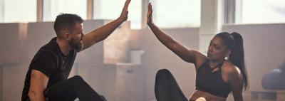
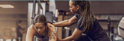
Whether you're at the beginning of your journey to kickstart a career in health and fitness or looking to boost your understanding of the wider wellness space, you've come to the right place. We have a treasure trove of articles filled with industry tips, useful skills, dates for your calendar, and inspirational stories to help you expand your knowledge.
From personal training to nutrition and everything in between, our team of subject matter experts have created a collection of insightful content that will empower you on your path to success.
The Training Room Strengthens Industry Presence Through Collaboration with Which Personal Trainer Course (WPTC)
Posted 26 February 2026
The Training Room, one of the UK’s established providers of fitness and personal training qualifications, has been highlighted as a trusted education provider on Which Personal Trainer Course (WPTC), an independent comparison platform designed to guide individuals towards reputable and accredited training pathways in the fitness sector.
Nutrition advice and tips for problematic skin
Posted 23 October 2025
If you’re looking to improve your complexion and clear your skin from the inside out, your diet plays an integral part in reducing lingering skin issues.

Flexible careers in fitness and nutrition for new mums
Posted 23 September 2025
Looking for a child-friendly job? Find out why fitness & nutrition careers are becoming increasingly popular choices for many new mums (and parents in general).
Should I study nutrition and personal training courses online?
Posted 15 May 2025
In this blog, we explore the key benefits of studying nutrition and personal training courses online so you can see exactly why it's now the go-to study method.

Learner stress awareness: How to manage academic pressure while studying online
Posted 01 April 2025
Whether you're juggling coursework, exams, or personal commitments, academic stress can quickly become overwhelming. Find out how to manage it in our blog.

Categories
Blog Archive
2026
2025
2024
2023
See what our learners are
saying about us
I’ve just completed my course via the E-learning academy and I want to thank Nick Hewett, my tutor for his exceptional guidance and support. He always responded to my emails and marked my work submissions very promptly, giving really helpful feedback. Couldn’t have asked any more of him.
Andrew4th May 2023. TrustPilot
I just completed my L3 PT Diploma as an e-learning course. It was the perfect option to be able to self-pace my study and coursework as I couldn’t commit to a purely weekday or weekend course, and could do my work when it suited me. The training room provides ample resources for self-study, and a tutor who is always there to help. Hasit Jethwa, my tutor, was excellent at answering any of my questions quickly and was really clear and useful in letting me know what I needed to do! Having Hasit as my tutor really added to my experience of qualifying with The Training Room. Thank you!
Freya1st June 2023. TrustPilot
I’ve just received a Pass for my theory exams, so thought a review would be a good commemoration!
I took the Hybrid Course; a weekly live lecture on Zoom, coursework on Google Classroom. My tutor Hasit Jethwa is a Physio and amongst other accomplishments. He is highly knowledgeable, a self - confessed nutrition nerd, eloquent, and a pleasure to interact with. I really enjoyed my course, and have taken away so much to carry on learning.
It’s a flexible course style which fitted around my lifestyle and other commitments well. L4 Nutrition here I come.
Lucy27th March 2023. Trustpilot
My tutor Liz Shaw has been an absolute diamond! Her support and encouragement throughout the course has made my experience at the training room better than could have imagined. Defo lucked out with her as my tutor. Her knowledge and background in personal training and dance is strong and her teaching style is solid! Thank you Liz and big thanks to the training room!
Venus14th February 2023. Trustpilot
I've just completed the L3 Diploma in Personal Training with the Training Room and would highly recommend it. I took the hybrid option which meant I could fit the work in around working full time.
The tutors were really knowledgeable and supportive throughout the course, and I wanted to give a special shout out to Mark Fox who was just amazing. Mark really knows his stuff and gave us so much help and support in the online lectures, but also any time I reached out to him. He was really quick to respond, and although I'd finished the teaching part of the course I still felt I had support whenever I needed it.
This qualification really is going to change my life and I can't wait to get going. Thanks again to the Training Room and Mark.
Alison9th May 2023. TrustPilot